 Friday Jan. 31, 2014 @ 9:48 am By
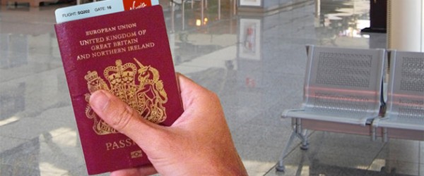

Why hasn’t this been done yet? It seems so logical. If you have ever looked at a boarding pass it is mostly like reading hieroglyphics. It is cryptic at best. I have looked at hundreds over the years, and they suck to decipher as your key info is basically buried in there amongst a bunch nonsense that has no real value to the average user.
Peter has come up with a very simple, clean, modern and slick design that makes key information more accessible and feels less awkward to handle (especially if you have a passport). It is really as simple as that, but until this point, no one has actually tackled it.
But the images say it all.
The current boarding pass we all know

Common Boarding Pass
Peters’s Idea:

Peter’s New Boarding Pass Concept
I say Peter Smart’s design FTW.
Photo Credits: petesmart.co.uk
Like what you just read? Subscribe!